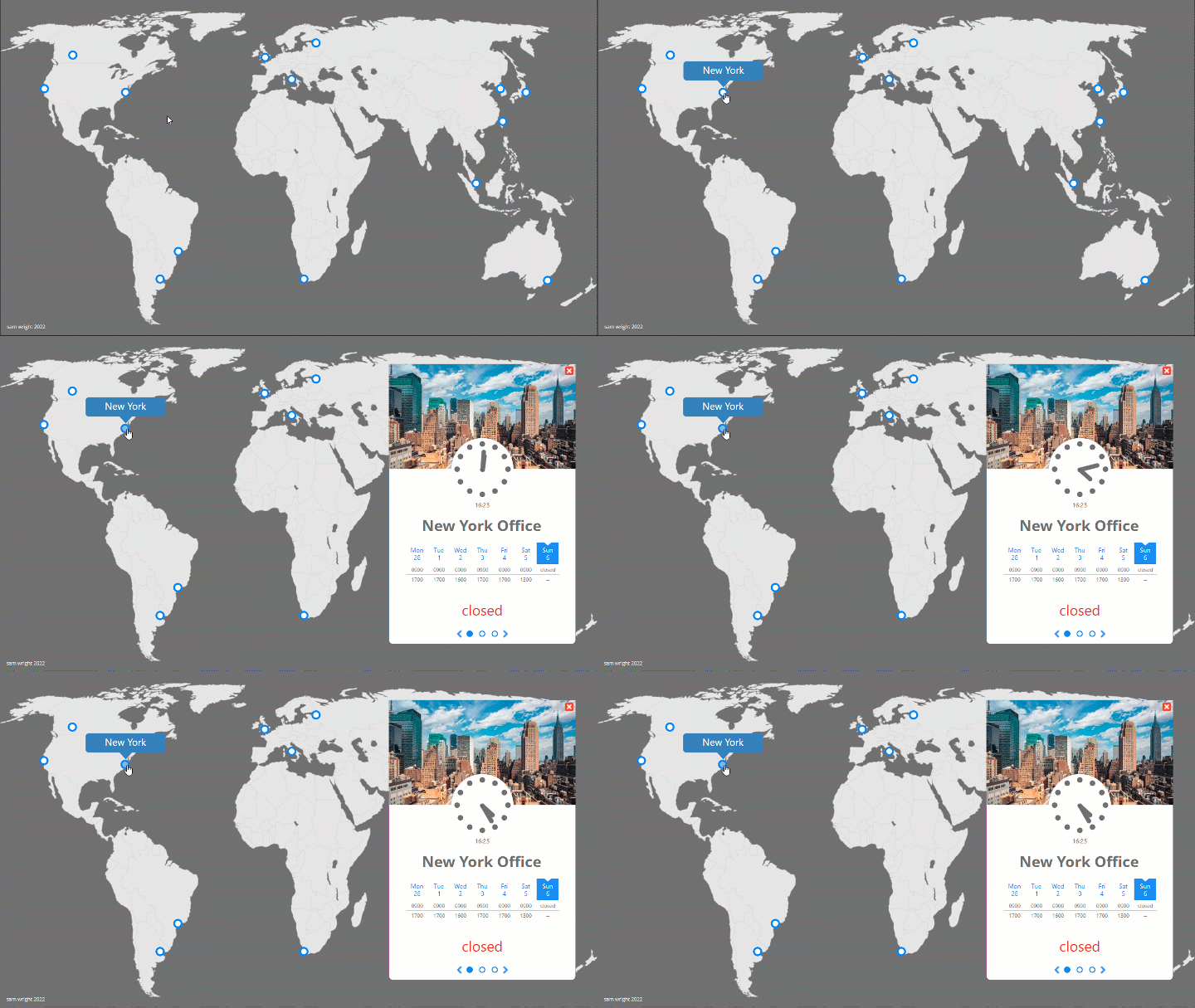
Corporate Location Map
Bringing life to a list of locations and people whilst solving communication issues caused by staff operating in multiple time zones.
Overview
A multinational organisation is experiencing issues with staff communication between offices. This concept project provides a solution that can be delivered during onboarding to help staff understand and navigate differences in operating hours effectively.
Knowledge of staff availability and the ability to direct queries effectively can make the difference to a company’s bottom line. I created this project because:
Having worked for multi national organisations before, I know how vital it is that colleagues can communicate with each other efficiently.
I wanted to demonstrate the capability of eLearning software to act as an infographic providing time and location specific information.
Responsibilities: Instructional Design, eLearning Development, visual design
Target Audience: Sales staff at a global manufacturing company
Tools Used: Articulate Storyline, Adobe XD, Adobe Photoshop, VSCode, JavaScript
The Process
I approached this task with the objective of establishing the key details required for staff to communicate effectively with each other in different areas of the world. I also researched factors that affect performance amongst dispersed workforces and determined that humanising the information would help to enhance cohesion. I then researched a number of potential locations and determined the information that should be included for each:
Current time at the location
Current date at the location
Opening hours for the current week
Current opening status (including if a location will be opening or closing soon)
Address and contact details for each location
A map showing both the location and surrounding area
Key staff
Real time images of the locality
Visual Mockups
Once I had established the features required to achieve my aims, I used Adobe XD to produce visual mockups of how I wanted the information to fit together. Drawing on atomic design principles to ensure that information was segregated in a way that was easy to understand but also intuitive to navigate:
Prototype
Once I had established a visual layout, I developed a working prototype for a single location in the Western Hemisphere in order to test functionality of the time and date features and to fine tune the user experience. I then sought peer feedback upon which I made revisions.
With revisions completed, I then extended the prototype to include an additional location in the Eastern Hemisphere to test effective transition between timezones. This incremental approach ensured that rework would be avoided when scaling the project up to all of the 14 locations that I had chosen to include.
The Build
I made use of Storyline’s ability to work with JavaScript to enable the correct date to be displayed at each location. I then used moment.js to obtain two separate arrays; one with the date for the next seven days in the given locale and one with the date for the seven days previous. I then spliced the arrays and assigned the values to variables in Storyline. Each column in the calendar would then be populated with the correct date for the selected timezone based on the value of the current day.
Displaying the time in analogue format also required the use of JavaScript, this time to obtain the current time at the location in hours and minutes. These values were then passed to Storyline variables to act as target values for the required time, which the hands of the clock move to on command. Differing imagery also appears which is appropriate to the current time of day.
Embedding of Google Maps was achieved by inserting each iframe code as a web video, with livestreams inserted as videos from websites.
The addresses and contact details used were randomised and images of staff members were obtained via stock photography websites, with consideration made to ensure diversity.
Results and Takeaways
The final product has received positive feedback for its ability to bring a sense of connectedness to a network of dispersed colleagues. Usage of a location map such as this one will aid awareness of colleague availability by breaking down and displaying complex information in a way that is simple and intuitive.
The project also demonstrates that software such as Articulate Storyline can be empowered through the use of JavaScript to display information that is relevant to the learner depending on time and place, which I intend to exploit in future projects.
Other projects
The benefits of pet insurance
Experience an interactive scenario driven learning experience with gamified elements.
Smart service
Here’s an innovative branching scenario that provides continual visual feedback of a customer’s emotion based on the learner’s cumulative responses.


